 This is the drawing I made for draw project 2010. The media is charcoal, watercolor, pencil and white out.
Friday, December 11, 2009
Draw Project
This is the drawing I made for draw project 2010. The media is charcoal, watercolor, pencil and white out.Thursday, December 10, 2009
Hanging Laundry
 This is my most recent finished painting. Lovely. I feel genuinely happy with the outcome because I can see more than I expected. The folds in clothing, undertones, and slight color changes. I just submittted two paintings for a contest and I entered a drawing into the DrawProject. I was very excited when I walked over to FedEx Monday morning in the snow with my drawing. Nice.
Tuesday, November 17, 2009
Hmm..

Tischgesellschaft
Rat King, Katharina Fritsch

I feel so tired. I've been trying to connect myself to the artworld. I posted my artwork on Saatchi student artists, and made some new friends.I am getting into it, and I've been strengthening my support systems. This is a link to my page on saatchi art students http://saatchi-gallery.co.uk/stuart/StudentArt/ast_id/88950/Molly%20+Bair
I found an artist I really like. Her name is Katharina Fritsch, she plays with realities that appear like an apparition but yet mimick feelings toward a mundane reality. In an everyday atmosphere there are undertone feelings. Whenever I feel very tired, everything feels like it has a gray undertone and is undulating slightly. She uses grids and repetition which is a common theme in nature.
Monday, November 16, 2009
Second Painting in the Senior Show
I titled this painting branch study. I'll edit the post when I measure the actual painting. The texture to this painting is very strong. A friend warned me about my impatience. This canvas has been gessoed over three times and textures show through. With my latest painting I've been working in shorter intervals, allowing time to break from the painting. My impatience is a result of my standstill, as I am working to pull through and create images that I truely want to see. I've been finding if I work in shorter intervals, I am more reflective and it allows more time for the watercolor paint to dry. This painting is water color and Magazine paper. 

Midway Show

This is the gallery postcard for my senior class's Midway show opening... I am the kid playing chess against the turtle. It's really blurry because I tried to crop the image on my own computer. I am happy to say, I got the opportunity to make this image in Abode Illustrator. My class contributed by sending me images they would like to have represent themselves in the 1/2 way house. The opening was on Nov. 5 and the show is running to Dec. 4.

Wednesday, November 11, 2009
Shameless but that's ok
This is the start of my Laundry painting And this is the final product
 Laundry mixed Media
 And this is the final product
 Laundry mixed Media
I've been reading articles and looking more at contemporary artists. Illustration combined with the ideas on what it is like living in today's world. There's a lot of metaphors and play with light characters with deeper meaning. I want to continue working with representational but I want to get into the gray area of representational/abstraction.
I want to study structure and continue building planes... but at the same time I want to reach a little bit beyond traditional study and have a slightly modern take. I've been using bright, transparent colors, and playing with layering and building.
I've been painting clothing, because I am getting close to abstraction but I am still grounded in the real world. Art is an illusion but some people will claim reality is an illusion. So right there is interest. I've been playing with clothing and bringing them to a level of an inbetween abstraction and representational painting. That is how my world appears when I am doing laudry at three o'clock in the morning.
I've found another gray area between personal and objective. I don't have an image that is a straight out my reflection, but when I throw a bra onto a laundry hook or pile of clothing, it appears personal yet removed from the artist. It's sad that I have a decent collection of bras by working at a bra store... but I like the feminine touch.
Monday, November 9, 2009
Sculpture and sketch
This is a heart I carved out of plaster in 2008. It is coated with red acrylic paint.


This a ten minute sketch of Derek. I was practicing for the Cedar Crest College talent show. My talent drawing a portrait in ten minutes. It almosted worked out, but Iam happy to be a part of the show.


This a ten minute sketch of Derek. I was practicing for the Cedar Crest College talent show. My talent drawing a portrait in ten minutes. It almosted worked out, but Iam happy to be a part of the show.

Monday, November 2, 2009
Joe Page Installation
This is a picture of me sitting in front of Joe Page's installation Flow Chart at Cedar Crest College. I am very content because I helped to set up the installation and the final product is simply fantastic

More Art Pieces
This is a pelvis carved out of Plaster, I submitted the sculpture to the Vagina Monologues Gallery.  This is a study of sticks I did. This is actually my second water color painting... I found a new love for the medias water color and india ink
 This is a piece I submitted to the Merchantile Gallery in Easton, PA. The lion fish is a print there is ink, acrylic and pieces of magazines.

 This is a study of sticks I did. This is actually my second water color painting... I found a new love for the medias water color and india ink
 This is a piece I submitted to the Merchantile Gallery in Easton, PA. The lion fish is a print there is ink, acrylic and pieces of magazines.
Saturday, October 24, 2009
Wednesday, October 14, 2009
Paintings part 1
Here is three of my paintings
The first one is titled My Nature. It explains my interests and intentions. I love Nature Writing, it is my favorite Nonfiction Genre, and it is a sort of reflection of my connections between science, art, and writing.
 Strength and Structure. This is a painting done in 2008. Magazine and Acrylic.
 This is my first painting finished in college. It's a self portrait in front of my elementary school play ground. Acrylic and Magazine pieces
Wednesday, October 7, 2009
Half way House
This is arough draft for the senior exhibition card. Trish said she would help m,e load it onto illustrator tomorrow morning. Love, Molly

Thursday, October 1, 2009
james Bloomfield
This is a print by James Bloomfield. I found him in an antique store in Kentucky. I can not explain why I really love this print. I honestly debated spending seventy five dollars for it. The print reminds me of an artwork I've seen before, but I don't remember. I just feel a strong like for it... odd right?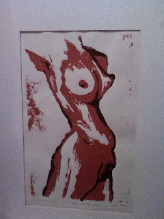

James Bloomfield he is a folk artist who lives as a hermit in the mountains. Most of his art is wood carvings that have a religious theme... I just tore apart my dorm room looking for the brochure from the antique store, and I tried to find information on him online, but I can only find small bits of information on him and his place with the self taught and outsider artists. The most informative page I found is his blog site... I can potentially be a fan...
Saturday, September 26, 2009
Check this out

Lucy Gans
My boyfriend and I met on Friday night. We went to see Lucy Gans show at Moravian College. I got excited because there is a hallway of these incredible self portraits in the student center. This is the artist, whose poster is on my wall. Her portraits are distraught, there is an incredible injustice against women. The fight for equality is far from over. There is still high statistics of domestic and work place abuse and crime against gener. The drawing representing the most intense statistics, the portrait covered her eyes. In other portraits sad truths caused her eyes well up with tears. I turned to Derek and asked him, "Do you think women are weak?" I felt sensitive over lost. I tried to follow the writing of ghostly, partially erased script beyond and below the portraits.
Her paintings spoke of truth and reality but also revealed emotion of a single person. Someone cares about these women. And when my boyfriend and I left, I knew two more people cared about these statistics and the women they represented.
Rob Sato
The show in the Metropolis gallery this month is Robert Sato. I loved the show. There were images of two faced people. Falling planes with trees attached to them. The images revealed destruction and battle. Man vs machine vs nature. There were painting of crime scene because the computer user was shot by video game he was playing. It was really grim... the realities we can play with.
In the middle of the gallery on the table was a Juxtapoz magazine. I stoped over images by an an artist known as Rockin Jelly Bean... I couldn't stand the images, I felt disgust and uncomfortable. I didn't like looking at images of highly sexualized women with ice cream or candy. I know it's a hyberbole on modern advertisements... but what about natural beauty and actual love for women... it's a superficial image... the paintings were missing everything I love about women, and being a woman.
Paintings and Sketches September 2009
Sketch of a boot with ink and water color.
It's been an odd beginning. I've been painting pictures of mundane things. Someone told me there is a humbleness to these, but there is a vacancy due to an absence of person. The paintings of dying apples also hint at a fragility of life... it's been unconcious and unintentional. I need to change directions again... I need to figure out my true intentions quickly. I need to get up, my paintings from my fall semester last year. The reason is, I switched from complete subjectivity to complete objectivity. Complete subjectivity is personal, revealing, and doesn't connect with an audience. Complete objectivity... is just a painting.
I am afraid of the fact, the Hemlocks are dying, and scientists do not what type of tree is going to replace them. There is a lot of uncertainty, and contemporary artists confront this uncertainty with irony. Something sweet is hurting or bitter or is hiding darker intentions. I get it, but now I am going to work by connecting with other recent artists to figure out who they are, and what it means to be an artist today. It's not easy but I have to try.


Saturday, September 12, 2009
Painted Chest

In 2006 my grandfather gave me a trunk to take to College. When I got the trunk in my dorm, I created a painting for it. The painting is strange. I love poems by William Butler Yeats. And I chose his poem Leda and the Swan. I love the final words, "Did she put on his knowledge with his power?" The painting is referencing knowledge learned by nature, amongst other personal and familial symbolism.
And the painting is ok, I want to stay away from making personal symbolic paintings. When I see mine, I sometimes feel as though I am looking into a mirror, and it's not the image I would like everyone to see. It's easier for me to communicate a message that isn't personal but one that shares and relates to more people. The reason why I am posting this image is because I did take the time to make this painting and it is a reflection on my development as artist.
Wednesday, September 9, 2009
Late Night Diner
I am excited because I had two cups of coffee and a bowl of chocolate icecream at 2 o'clock in the morning.
I went to the A-town diner with my friend, Lindsay. She is a studio Art major as well. She ordered french fries with her coffee.
We spoke about artists and the impact of art in our lives. She brought with her a book of paintings done by Alice Neel and I brought a book of art by Picasso. It is very strange to compare the two artists because there are similarities. Especially with an almost outline of the figure and flat colored bodies. When I look Neel's painting I feel as though the heads of her figures are constantly nodding because the head especially the face appears to have more weight than the whimsical body.
And... I've always loved Picasso. He has broken down and rebuilt realities, dimensions and imagination. His paintings have a curosity that lure the viewer and pull their eyes rapidly around the painting. The composition is usually very striking with masks figures, floating heads, lights, and people who appear to be emotionally on another plane.
I realized though, when Lindsay asked about my plan for the senior show that I am slightly nervous. I am anxious about my senior project. I want to create something... strong, but reflective. Existing, but only existing in part. Curious but plain. I think that is why I love painting and drawing sticks.
I was painting a nude figure today in class. I couldn't figure out the perspective and balence. I wanted to portray her realisticly, but I couldn't. Even with a lot of practice, I couldn't do it. I have doubts that I will never reach a finished image. And worse yet they transform into thoughts about not being good enough, or smart enough... it is an endless chain. I keep reminding myself that, I'll see this through because that's what I will learn to do. Tomorrow is a new day, and I will be back in the painting studio.
Tuesday, September 8, 2009
Art Criticism
I started to read, In Relation to the Whole by Rackstaw Downes. I am very excited. The reason is I never thought to evaluate the Art Critic. The most I've known, probably learned from my Travel Soccer days, is if you get a bad review, practice more and make sure you're prepared to kickass next time. However, what if the art piece is not par to the critics standards of Art? Is it even worth to impress the professional if it deviates from the artist's truest intention?
Art used to be viewed in a Hegel Philosophy, which is learn from the past to determine the future. At one point Art was considered sublime when it redressed antique art. In other words study from the masters to out do their work. There also seemed to be security for artists to conform to the trends and movements of their time which continously aimed to improve the quality of art. Which may be necessary practice for an artist to survive. Although it was the plucky artists who made the strongest statments against conformity of the different art movements
I feel as though the Hegel way of thinking may be inadequate because I believe a person is not in direct competition with the past to eventually conform to present standards. I believe a person should be influenced by a master but develop his own body of work. Perphaps the most valuable criticism reflects on the Artist's commitment to his study and how well he achieved his goal.
When evaluating an art piece, I do my best to be honest. I want first the person to explain her piece. The first thing I look for is reflection. With great reflection exists time, observation and development of skill. Technique and quality are important because there is a dialogue between the artist and the viewer. The Artist should strive for the best possible dialog to deliever her message to the viewer. Because the delivery of the message gives art strength and meaning whether it is personal or universal. By delivery, I mean composition, style, skill, time, and motivation.
Saturday, September 5, 2009
Beginning of an Artist Statement
I wrote down words today to form an artist statement. It's not personal, most of it is common sense. I took Nature Writing last year, and I did well in the course. It's an odd genre of writing because as I sat in class, I felt a sense of looming danger as a consequence for carelessness. All Nature writers feel this; they write with hope to encourage others to act. As it should be because things may be bad, but they can always change. After explaining this, I want to write my scattered words.
Random Words for Artist Statement
Nature is to Human, repeating patterns and syststems
Humans have need to control chaos but life is random
Lose of control random probability, repeling electrons
beauty in reflection. Experience gained by time
Frankenstein
Adventure, lesson, risk-choice
Millions of beliefs, all valid by each own person, inequality
"Everything you imagine is real": Picasso
Collage of diversity
Ugly is to beauty as Nature is to Human
beauty is to ugly as Nature is to Human
Fate vs Freewill
Either Romantic thinking or not
Learn to love Nature
or natural diseaster for future generations
Learn to embrace eachother
or human diseaster for future generations
by existance of art we may communicate through different times and spaces
Welcome many individual realities and identities because everything ties
together
I want to write my first draft next week.
Thursday, September 3, 2009
Contest Entries
I sumbited this image for a magazine cover design... it was way too dark. I know for next time not to use charcoal for entries. It is really rough. This image won a t-shirt contest... although it was banned from my school.... ..... ....
 This an ink and water color painting that won for the Health and Wellness logo for Cedar Crest College. I made a mistake though. Cherry wood represent knowledge and health. Cherry blossom represents short lived and fragile. But since we're human, I imagine we all feel that way when it comes to our health.

 This image won a t-shirt contest... although it was banned from my school.... ..... ....
 This an ink and water color painting that won for the Health and Wellness logo for Cedar Crest College. I made a mistake though. Cherry wood represent knowledge and health. Cherry blossom represents short lived and fragile. But since we're human, I imagine we all feel that way when it comes to our health.
Pen and Pencil drawings
Pen sketch of sword on fabric Iinterned at Landis Valley Museum this summer and the next two sketches are from there.
 Iinterned at Landis Valley Museum this summer and the next two sketches are from there.


Sketch book drawings
This is an ink sketch of Derek. Not bad, but the nose is too small.
 I went to Kentucky this summer,and stayed in a cabin. This is my jacket hanging off the rail.
 This is a sketch of my ink bloter on fabric. I like it.
 Derek made a campfire, and I drew a picture of logs... I swear I am not lazy, and I could have helped if I really wanted too.
 Thisis my favorite sketch I feel as though I drew my collared shirt so nicely. It makes me smile.

This is a chair... nevermore

 I went to Kentucky this summer,and stayed in a cabin. This is my jacket hanging off the rail.
 This is a sketch of my ink bloter on fabric. I like it.
 Derek made a campfire, and I drew a picture of logs... I swear I am not lazy, and I could have helped if I really wanted too.
 Thisis my favorite sketch I feel as though I drew my collared shirt so nicely. It makes me smile.
This is a chair... nevermore

Saturday, August 29, 2009
Paintings and Prints 2008-09
At Cedar Crest College there are three things no Art Student can escape with out knowing. They are the Art class's female Model. The Statue of a decapitated nude boy squeezing a fish. And this fellow Baum, this is a painting of the bust of Baum. His face crooked because the bust was made post stroke.
 This is a painting of my boyfriend's parents. I made them a christmas gift in 2007. It's slightly odd, but I feel a sense of Jackson Pollock, especially his early work "Going West". I used similar browns and the sofa adds the same oval composition.
 This is a lion fish, my first wood cut print. I love using wood cut. There is a straigh line crossing through the eye. I accidently slipped the blade and cut my finger. I got frustrated, but then I took a break went online and started looking up internships. I then got an internship at Landis Valley Museum for the Summer, cool right.
 This a painted box for my Boyfriend, Derek for Christmas. The guy loves owls. I wasn't sure about posting this image because I am not keen about the style. It reminds me so much of the Harry Potter Fan art... although if I wanted I could submit in a Harry Potter fan art contest... and.... and...
 This is a study of Derek. This is a fun story. We were both at my favorite coffee shop for dinner. I started to draw pictures of him on napkins. Oddly enough, I started to get attention from passerbys. So I went out got a canvas and the painted a study of him watching Family Guy... yes it is that easy.
Derek, as a college requirement, has to take, Art History. He had to write a paper on one thing he thought is Art and one thing that he doesn't consider Art. He chose to bring in my painting of him as Art. His professor, said my painting style resembled Van Gogh. Blushing.... although Van Gogh did go insane, and I hope very much that isn't in my future.

Sketches 2008-09
This is one of my latest nude studies, Spring 2009. My art professor sophomore year said my work resembles Kathy Kollwitz. I love Kolwitz's prints and figure studies. But, they really scare me.. they represent the dark fear of loss and grief.

2009, I love the belly and legs of this figure. Something definitely went right. 2009
2009
 This is an adstract drawing, drawn from a close up of a still life. I saw fish and I used magazines as a method for adding color.
 This is a nude study, it's ok. I really like the belly again. I love the shadows on necks, and they always appear very strong.
 This is a 30 piece still life drawn in 2008. Want to count the images? I just tried and gave up. My favorite is the sketch of the lantern. Go to the water bucket, follow the spout and there is the top of the lantern.
 This a water color and charcoal drawing from 2009
 2009
2009
 This is a portrait of a girl from my drawing class in 2008.
 Study for the painting Baum.
 2008.
2008.


2009, I love the belly and legs of this figure. Something definitely went right.
 2009
2009 This is an adstract drawing, drawn from a close up of a still life. I saw fish and I used magazines as a method for adding color.
 This is a nude study, it's ok. I really like the belly again. I love the shadows on necks, and they always appear very strong.
 This is a 30 piece still life drawn in 2008. Want to count the images? I just tried and gave up. My favorite is the sketch of the lantern. Go to the water bucket, follow the spout and there is the top of the lantern.
 This a water color and charcoal drawing from 2009
 2009
2009 This is a portrait of a girl from my drawing class in 2008.
 Study for the painting Baum.
 2008.
2008.
Subscribe to:
Posts (Atom)